AI Checklist Log
Your design system
Font outside DESIGN.md
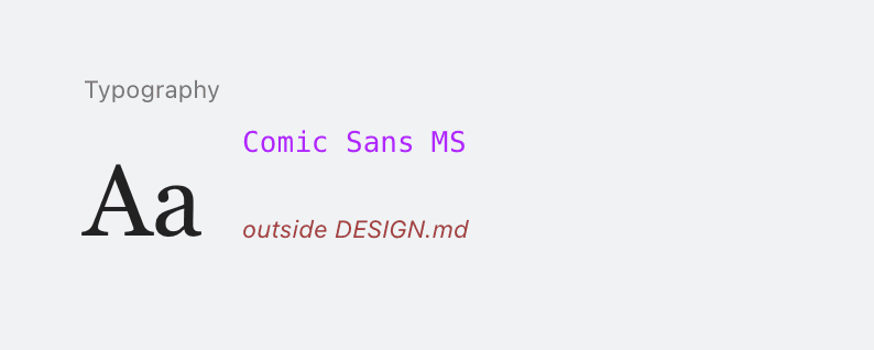
A font falls outside the documented type system. Use an approved face or update DESIGN.md.
Color outside DESIGN.md

A literal color falls outside the documented palette. Use a token or make the addition intentional.
Radius outside DESIGN.md
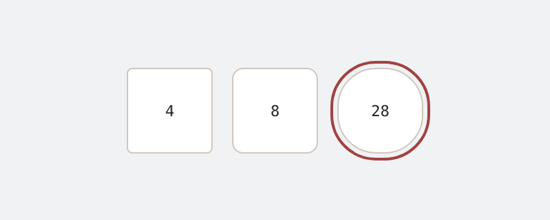
A corner radius falls outside the documented shape scale. Use a token or update the system.
Font size outside DESIGN.md

A font size falls between documented type steps. Use the scale or add a deliberate new step.
Visual Details
Decorative grid-line background
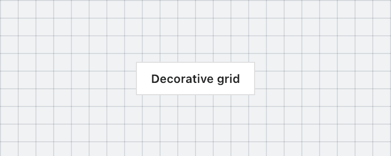
A decorative grid covers a surface without supporting a canvas, map, or measurement task. Use product structure or a plain field.
Border accent on rounded element
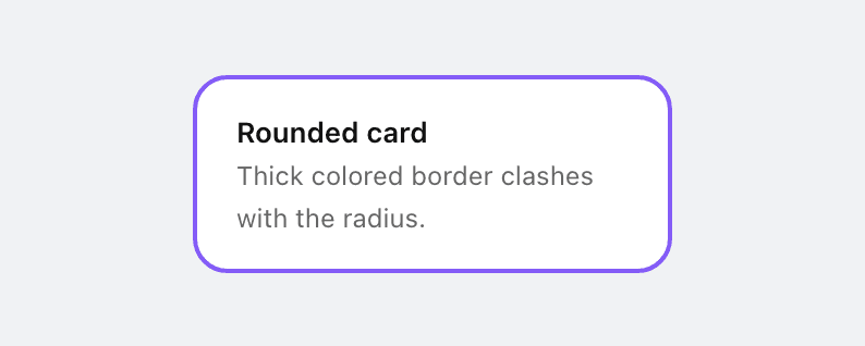
Thick accent border on a rounded card. The border clashes with the rounded corners. Remove the border or the border-radius.
Glassmorphism everywhere

Blur effects, glass cards, and glow borders used as decoration rather than to solve a real layering problem.
Side-tab accent border
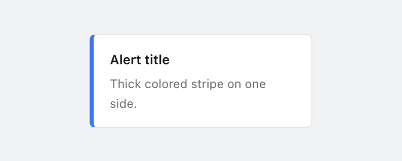
Thick colored border on one side of a card. The most recognizable tell of AI-generated UIs. Use a subtler accent or remove it entirely.
Hairline border with wide shadow
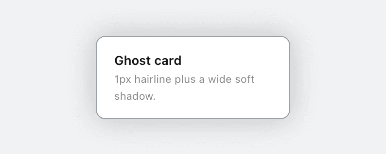
A hairline border paired with a wide, diffuse shadow is a recurring generated-UI signature. Commit to one: a defined edge or a soft elevation, not both at once.
Repeating-gradient stripes

Repeating-gradient stripes used as surface decoration are a recurring generated-UI signature. Reach for a deliberate texture, or leave the surface plain.
Extreme border-radius on cards
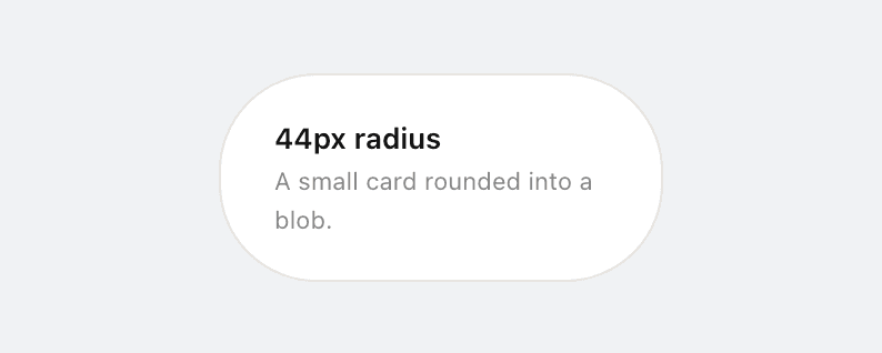
Over-rounding cards, sections, and inputs (24px and up on a small card) rounds everything into the same soft blob. Cards top out around 12 to 16px; reserve full-pill for tags and buttons.
Amateurish hand-drawn SVG

Hand-coded SVG illustrations of scenes or mascots read as amateur doodles, not whimsy. If you cannot render it with real assets, ship no illustration rather than a sketchy fallback.
Typography
Kicker / eyebrow label above heading

A tracked uppercase label above a heading borrows editorial authority it has not earned. Delete it, or work the words into the heading.
Undersized functional text

Functional text under 11px fails on small and high-density screens. Keep links, labels, and table cells at a readable size.
Flat type hierarchy
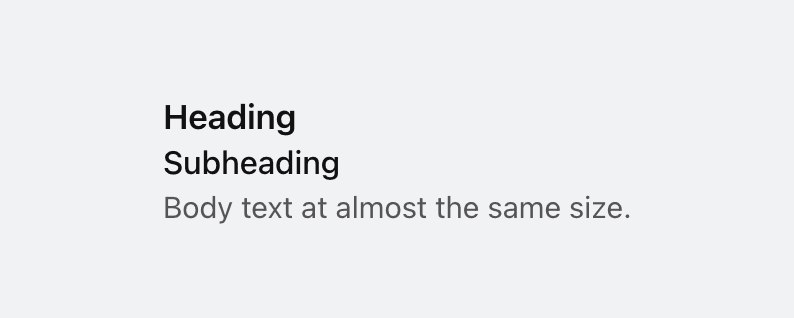
Font sizes are too close together. No clear visual hierarchy. Use fewer sizes with more contrast (aim for at least a 1.25 ratio between steps).
Icon tile stacked above heading

A small rounded-square icon container above a heading is the universal AI feature-card template. Every generator outputs this exact shape. Try a side-by-side icon and heading, or let the icon sit in flow without its own container.
Italic serif display headline
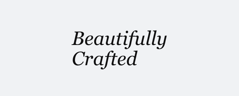
Oversized italic serif as the primary hero headline reads as taste in isolation but has become the universal AI-startup landing page hero. Set it roman, or move to a non-serif display face. Editorial registers may legitimately want it; judge by context.
Hero eyebrow / pill chip

A tiny uppercase letter-spaced label sitting immediately above an oversized hero headline, or the same shape rendered as a pill chip, is the default AI SaaS hero. Drop the eyebrow, fold the kicker into the headline, or run it as a breadcrumb instead.
Oversized hero headline

A full-sentence headline set at display size dominates the viewport, leaving no room for anything else above the fold. A punchy one or two-word headline at that size is fine; the problem is a long headline blown up too large. Set long headlines smaller, or tighten the copy.
Crushed letter spacing

Letter spacing pulled tighter than the point where characters keep their own shapes costs legibility. Tighten display type optically, not destructively.
Overused font

Inter, Geist, Space Grotesk, and the newest reflex, Instrument Serif, are used on so many sites they no longer feel distinctive. Each new wave of AI-generated UIs converges on the same handful of faces. Choose a face that gives your interface personality.
Single font for everything
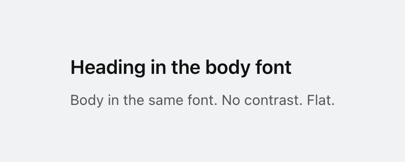
Only one font family is used for the entire page. Pair a distinctive display font with a refined body font to create typographic hierarchy.
All-caps body text
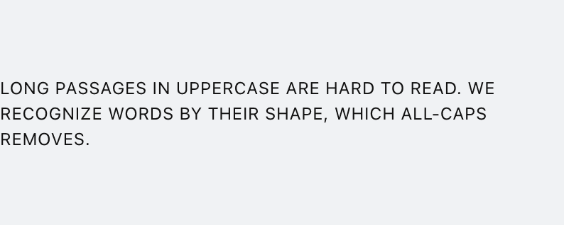
Long passages in uppercase are hard to read. We recognize words by shape (ascenders and descenders), which all-caps removes. Reserve uppercase for short labels and headings.
Color & Contrast
Radial-gradient background halo

A saturated radial glow on a dark page is a familiar generated-UI shortcut. Use a deliberate surface instead.
Decorative radial spotlight glow
A faint accent haze sits behind a section as a spotlight. Light the composition with real material, or let the surface stand on its own.
AI color palette

Purple/violet gradients and cyan-on-dark are the most recognizable tells of AI-generated UIs. Choose a distinctive, intentional palette.
Dark mode with glowing accents

Dark backgrounds with colored box-shadow glows are the default "cool" look of AI-generated UIs. Use subtle, purposeful lighting instead, or skip the dark theme entirely.
Gradient text
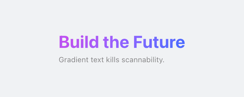
Gradient text is decorative rather than meaningful. A common AI tell, especially on headings and metrics. Use solid colors for text.
Gray text on colored background
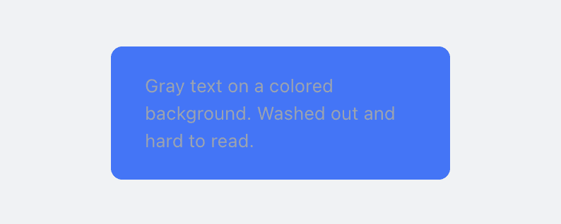
Gray text looks washed out on colored backgrounds. Use a darker shade of the background color instead, or white/near-white for contrast.
Cream / beige palette
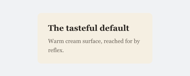
A warm cream or beige page background has become the default "tasteful" AI surface, reached for by reflex. Choose a background that comes from a deliberate palette, not the safe warm off-white.
Layout & Space
Tiny numbered section labels

Tiny numbers repeated beside headings imitate editorial structure without adding it. Let hierarchy and rhythm sequence the page.
Cards flush against the scroller edge

Scroller cards lose one edge because the panel has no matching inset. Keep both gutters consistent.
Text occluded by an overlapping element

An opaque layer covers readable text. Move the layer or give the text clear space.
One column stretches the first viewport
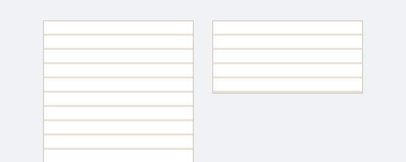
One opening column runs far past its neighbor, leaving dead space. Balance the columns or continue below the row.
Heading crowded against the previous block

A heading sits closer to the previous block than its own content. Give it more space above than below.
Hero metric layout
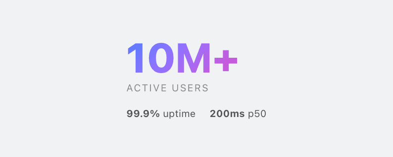
Big number, small label, three supporting stats, gradient accent. Used everywhere, trusted nowhere.
Identical card grids
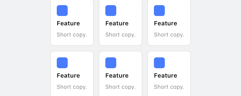
Same-sized cards with icon + heading + text repeated endlessly. The default AI homepage layout.
Monotonous spacing

The same spacing value used everywhere. No rhythm, no variation. Use tight groupings for related items and generous separations between sections.
Nested cards
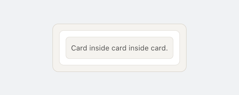
Cards inside cards create visual noise and excessive depth. Flatten the hierarchy: use spacing, typography, and dividers instead of nesting containers.
Line length too long
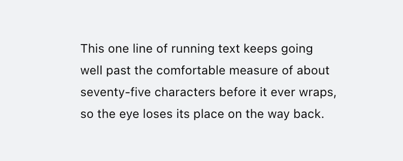
Text lines wider than ~80 characters are hard to read. The eye loses its place tracking back to the start of the next line. Add a max-width (65ch to 75ch) to text containers.
Content overflowing its container
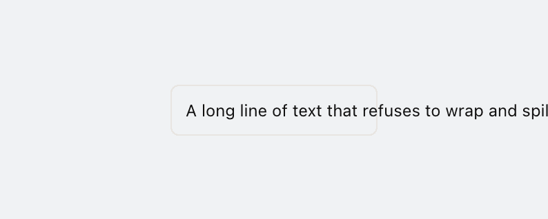
Content renders wider than its container, spilling out or forcing a horizontal scrollbar. Let text wrap, constrain widths, or give the region a deliberate scroll affordance.
Positioned child clipped by overflow container
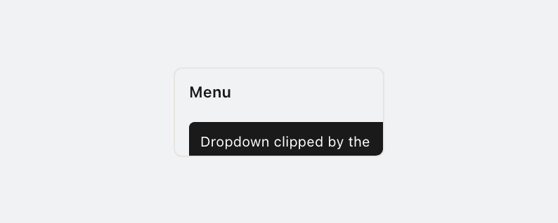
A clipping container (overflow hidden or clip) wrapping an absolutely-positioned child cuts off tooltips, menus, and popovers that need to escape. Let the overflow be visible, or move the positioned layer out of the clip.
Motion
Pulsing status dot

A decorative pulse makes static status look live. Animate only when the data is changing.
Decorative blinking cursor

A fake caret makes non-editable hero copy look like a terminal. Let real inputs own the cursor.
Auto-scrolling marquee
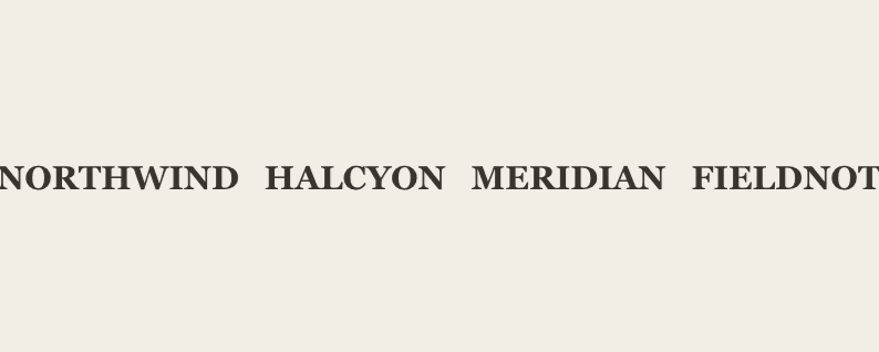
Continuous auto-scroll demands attention and hides content. Let people read at their own pace.
Bounce or elastic easing

Bounce and elastic easing on interface elements (a dialog that springs in, a card that overshoots) feels dated and tacky. Reserve spring physics for things that are actually physical; ease interface motion out smoothly (ease-out-quart/quint/expo).
Layout property animation
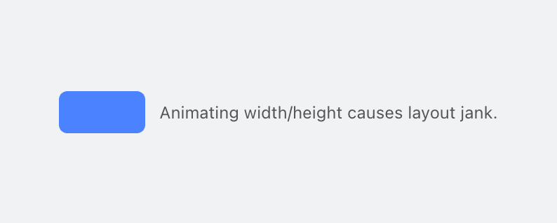
Animating width, height, padding, or margin causes layout thrash and janky performance. Use transform and opacity instead, or grid-template-rows for height animations.
Image hover transform

Scaling or rotating an image on hover is a recurring generated-UI signature. Let imagery sit still, or use a subtler, purposeful interaction.
Copy
Same text repeated inside one container

The same label appears in several slots of one card. Keep it once, where it matters.
Em-dash overuse
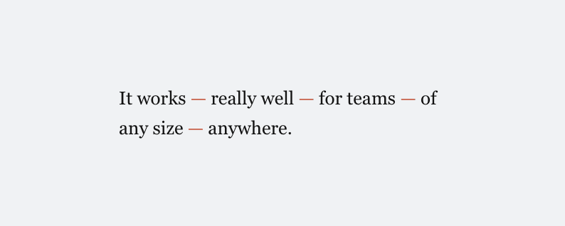
More than a couple of em-dashes in body copy is an AI cadence tell. Use commas, colons, periods, or parentheses instead.
Marketing buzzword

Generic SaaS phrases (streamline, empower, supercharge, world-class, enterprise-grade) are instant AI tells. Pick a specific verb and noun that says what the product literally does.
Aphoristic-cadence copy

Sections landing on a short rebuttal or a manufactured-contrast aphorism read as AI cadence, not voice. Once is fine; the repeated pattern is the tell.
Theater framing copy
Dismissing something as "theater" is a recurring generated-copy tic. Say plainly what the thing does or does not do.
Imagery
Shape-assembled illustration

Hero art assembled from generic SVG shapes reads like placeholder clip art. Use real illustration, photography, or a purposeful graphic.
Broken or placeholder image
<img> tags with empty src, missing src, or placeholder values ship as broken-image boxes. Use real images, generated assets, or remove the tag.
General quality
Uncaught script error on load
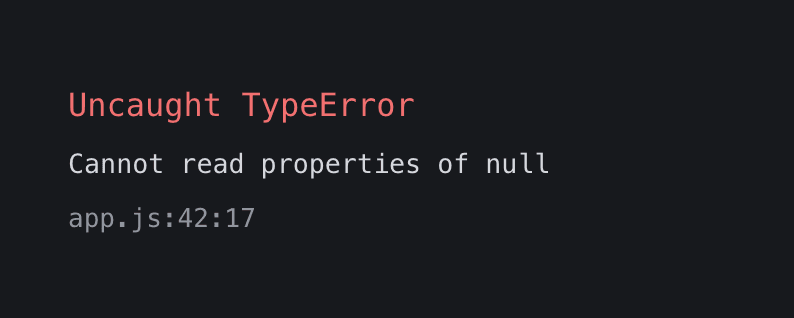
An uncaught load error can break interactions and hide content. Fix it before judging the interface.
Content invisible at rest
Reveal code left much of the page invisible. Ship content visible, then enhance its entrance.
Cramped padding

Text is too close to the edge of its container. Add at least 8px (ideally 12-16px) of padding inside bordered or colored containers.
Body text touching viewport edge
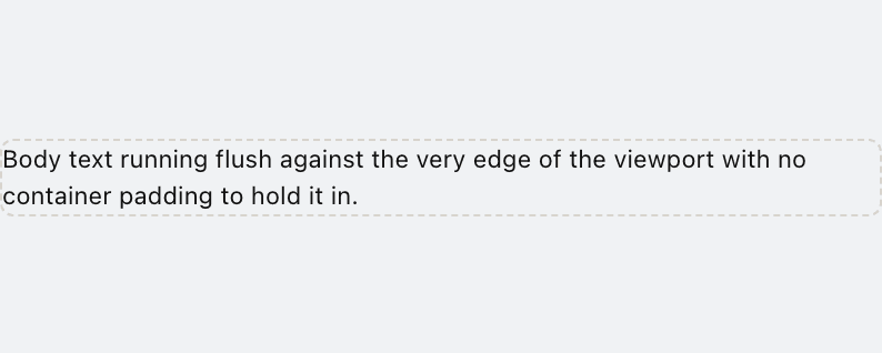
Body paragraphs render flush against the left or right viewport edge with no container padding. Wrap content in a container with at least 16px of horizontal padding, or apply max-width with mx-auto.
Justified text
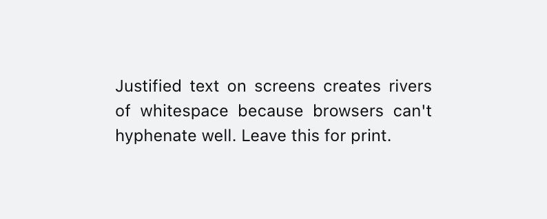
Justified text without hyphenation creates uneven word spacing ("rivers of white"). Use text-align: left for body text, or enable hyphens: auto if you must justify.
Low contrast text
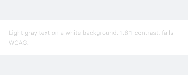
Text does not meet WCAG AA contrast requirements (4.5:1 for body, 3:1 for large text). Increase the contrast between text and background.
Skipped heading level
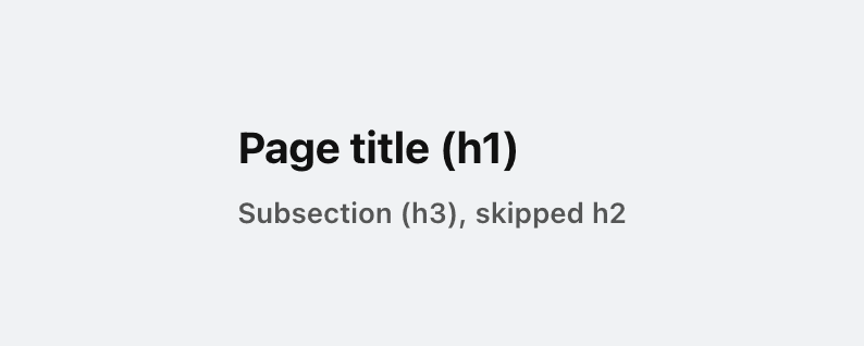
Heading levels should not skip (e.g. h1 then h3 with no h2). Screen readers use heading hierarchy for navigation. Skipping levels breaks the document outline.
Tight line height
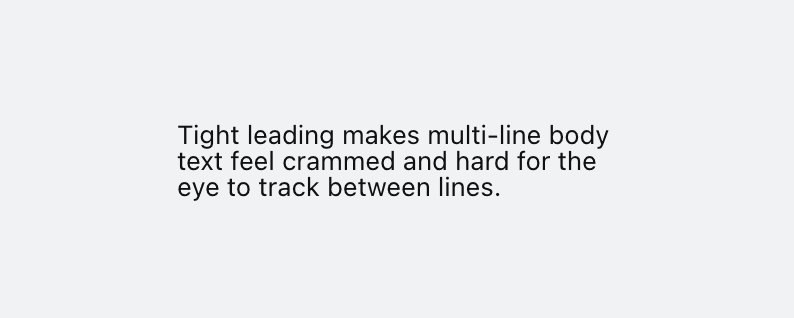
Line height below 1.3x the font size makes multi-line text hard to read. Use 1.5 to 1.7 for body text so lines have room to breathe.
Tiny body text
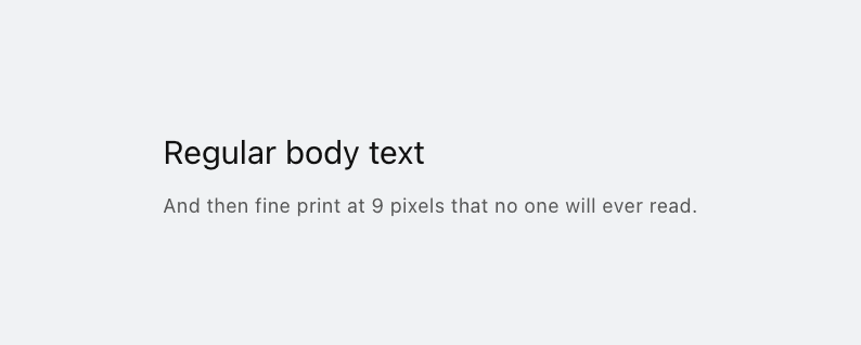
Body text below 12px is hard to read, especially on high-DPI screens. Use at least 14px for body content, 16px is ideal.
Wide letter spacing on body text
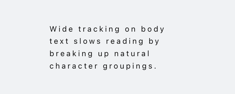
Letter spacing above 0.05em on body text disrupts natural character groupings and slows reading. Reserve wide tracking for short uppercase labels only.